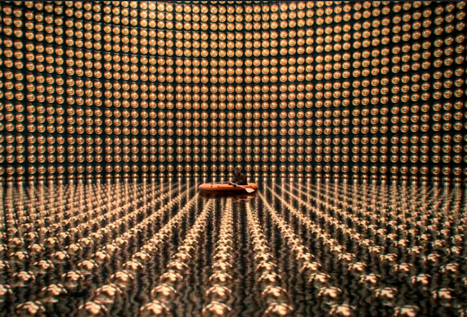
Neutrino Catcher
Super-Kamiokande Neutrino Catcher developed by the ICRR
In this curated selection of interiors that utilize paint, color and graphics, I am currently studying how narrative, abstract and optical treatments, influence interior spaces. Across all cultures and time periods, painted walls have been used to shape and transform enclosed spaces. This curated section on ‘Painted Walls’ focuses on interiors that employ a wide range of surface treatments using color and paint. A range of techniques includes many elements; e.g. narrative, religious, political, historical and commercial; trompe l’oeil, and pure abstractions. I have identified a selection of ‘painted walls’ that I feel makes use of this medium in both expected and unexpected ways. My own recent interest in exploring ‘painted walls’ began when I saw the three dimensional installation, “Boogie Fervor” by Mark Dean Veca, at the ‘Greater New York Exhibition’ at P.S. 1, Contemporary Art Center/Museum of Modern Art Affiliate in Long Island City, New York in 2000. Veca used wall painting to shape space in a way that I had not seen employed by interior designers before. With a virtuoso use of paint, color, and graphics, Veca created a layered experience out of a long raw rectangular loft space. Veca was given a room – the walls, floor and ceiling – to create “Boogey Fervor”, a site-specific installation. At one end of Veca’s space, the walls, floor and ceiling are painted in yellow. The other end is painted white tied together with a graffiti-ed bouquet that encircles the space, like a cross section. This acts as a portal, from the pristine white side he transforms the hall into a brash, yellow, psychedelic, boogey-man infested lounge complete with chandeliers. He used purple bean bag chairs as “found” soft sculpture to activate the space from formal to social. The use of paint, color and graphics reinforces different qualities in the spaces in the absence of architectural cues to demarcate change.This serves to reinforce a felt transition from a two-dimensional experience into a three-dimensional one as if stepping into and becoming part of an optical experiment. A second historical use of the ‘painted wall’, is in the Palazzo Davanzati, a 14th century space in the heart of Florence, reveals an unusual use of trompe l’oeil suggesting a tapestry hung in front of a wall. Near the opening to a lavatory, the wall painting creates the illusion of a hung tapestry being pulled aside to make visible the small room beyond. The abstract pattern painted on the wall ‘behind’ the ‘painted’ curtain is extended into the small room covering all the wall surfaces from floor to ceiling in a graphic language that feels very modern, rather than the historical usage that one might expect to see. The painted pattern on the lavatory walls resembles a simplification of heraldic coats of arms, a curious choice for this early water closet. The absences of transitional elements at the floor and ceiling contribute to an unusual ‘modernity’. In the waiting lounge on ‘Holland Boulevard’ in Amsterdam’s Schiphol Airport there are a series of five backlit panels (approx. 8’ H x 12’ W) whose background colors slowly cycle through a number of hues. The five screens divide the lounge section into five comfortable, pleasant, seating areas. These interiors referred to as ‘At Home’ lounges, created by Studio Linse Associates, have cozy home-like qualities. Painted graphics featuring silhouettes of familiar domestic artifacts, with comfortable real furnishings added, contribute to creating this. In this huge airport, the designers have used the specific surface treatment, projected color, light, and graphic elements to invite the users into a space that is intimate and relaxing, despite long waits and the proximity to a transit corridor that is always busy and packed with hurrying people. Here is another example of the economy of designing surface treatment to strongly affect the atmosphere of a very complex interior space.